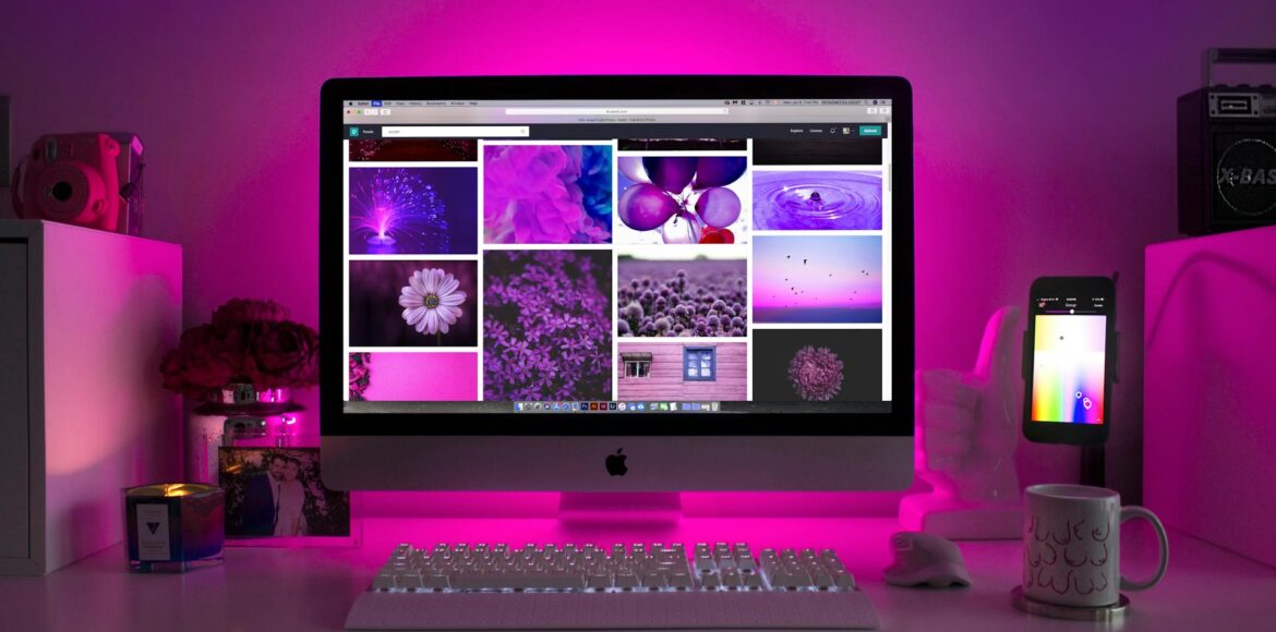
Color Psychology in Web Design: Choosing the Right Palette for Your Brand

Color psychology in web design plays a pivotal role in influencing user perception, engagement, and conversion rates. Choosing the right color palette is more than aesthetics—it’s a strategic decision that can significantly impact your brand identity and user experience. In this guide, we’ll delve into how colors affect human psychology and how to leverage this knowledge to boost your brand’s effectiveness online.
Why Color Psychology Matters in Web Design
First impressions are formed within 50 milliseconds, and color is a major contributor. Studies show that up to 90% of snap judgments made about products can be based on color alone. For brands, the right color scheme builds trust, enhances usability, and triggers emotional responses that align with your brand’s mission.
How Colors Influence User Behavior
- Red: Evokes urgency, excitement, and passion. Great for calls to action.
- Blue: Conveys trust, security, and calmness. Widely used in finance and tech.
- Green: Associated with growth, health, and tranquility. Ideal for eco and wellness brands.
- Yellow: Stimulates optimism and happiness but can strain the eyes if overused.
- Purple: Represents luxury, creativity, and spirituality.
- Black: Signifies sophistication, power, and elegance.
- White: Suggests purity, simplicity, and clarity—perfect for minimalist designs.
Choosing the Right Palette for Your Brand
1. Understand Your Brand Personality
Are you a luxury service provider or a fun, youthful brand? Your color choices should reflect your core values and market positioning. For example, branding and identity services from TreStars Technologies help decode your brand DNA to align your visuals accordingly.
2. Know Your Audience
Different demographics respond to colors differently. While younger audiences may gravitate toward vibrant and bold colors, older audiences might prefer muted and calming tones. Market research is essential to align your color choices with audience expectations.
3. Choose a Primary and Secondary Color
Start with one dominant color that represents your brand’s essence. Then add secondary and accent colors to complement it. Use tools like Adobe Color or Coolors to test palettes before finalizing.
4. Stick to a Cohesive Color System
Use a consistent color system across your website, mobile interfaces, and marketing materials. This includes button colors, backgrounds, and text. A professional website design and development team ensures your palette enhances usability and brand recognition.
5. A/B Test Your Color Choices
Color preferences can vary, so it’s crucial to test variations. Try different CTA button colors and track conversion performance. This data-driven approach refines your design decisions.
Best Practices for Applying Color Psychology
Use Contrast for Readability
Ensure there’s sufficient contrast between text and background colors for accessibility and readability. Tools like WebAIM’s contrast checker can help.
Apply the 60-30-10 Rule
This design rule uses 60% of a dominant color, 30% of a secondary color, and 10% for accent color. It provides visual balance while allowing key elements to pop.
Use Emotionally Aligned CTAs
If you want users to take action, match CTA colors with the intended emotion. For example, red for urgency (“Buy Now”) or green for trust (“Get Started”).
Consider Cultural Implications
Colors carry different meanings across cultures. Red symbolizes luck in China but may indicate danger in Western contexts. Be aware of your global audience.
Real-World Examples of Color Psychology in Action
Facebook: Uses blue to convey trust and dependability.
Coca-Cola: Leverages red to spark excitement and appetite.
Spotify: Uses vibrant green to represent energy and innovation.
If you’re launching a new brand or revamping your existing one, consider the full-service launch package offered by TreStars Technologies to ensure your color scheme aligns with your business objectives.
How TreStars Technologies Can Help
At TreStars Technologies, we specialize in creating strategic digital experiences that incorporate color psychology to drive results. Our services include:
- Website Design & Development
- Branding and Identity
- Digital Strategy Consulting
- Lead Generation Services
- Social Media Management9
Conclusion
Color is a powerful psychological tool that influences how users interact with your brand. By strategically selecting a color palette based on your brand values, audience, and goals, you can create a website that not only looks beautiful but also performs exceptionally. When you’re ready to translate your color strategy into a high-performing digital experience, TreStars Technologies is here to help.
Ready to Power Your Website with Smart Design?
Schedule a consultation with TreStars Technologies and harness the power of color psychology to elevate your brand today.


